If you're looking for tips, tactics and tools to build your email list so that you can generate more leads and close more sales, you've come to the right place. In this post we'll look at some of the most effective ways to generate signups online and off so you can reach more of your ideal customers.
These slides came from a recent presentation I gave on list building tactics. You can check out the interactive slide deck at the bottom of this post.
List Building…or “How to Grow Your Empire”
Email and list building has always been a passion of mine. When people come into my office to talk about a new website, or ranking on the first page of Google, or running some Facebook ads, I always direct the conversation to, “how will this help build your email list? How can we turn those email subscribers into customers and revenue?”
On my digital marketing podcast, The Agents of Change, I get to interview marketing experts each week on topics like Pinterest, Local SEO, paid search, and Instagram stories. But regardless of their area of expertise, they are all focused on building their email list. They know that if they want to get hired as a consultant or sell more courses they need to have a robust email list.
Even if you're a Facebook marketing expert, you pay more attention to getting new email subscribers than to getting more Facebook followers.
In fact, when I get asked the question, “if you were starting your business today with everything you've learned over the past twenty years, what would you do differently?” the answer is that I would start building my email list from day one and never let up.
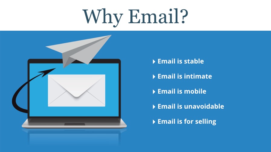
Why Email?
Why am I so bullish on email?
- Email is stable. Unlike your ex. ? What I really mean by that is with social media platforms like Facebook, you're at the mercy of the algorithm. Posts on Facebook pages used to reach 80% – 90% of their fans…now that's down to 1% – 3% for most pages. Or you could build a following on Twitter only to find that the only people who get traction and engagement there any more are sports stars, celebrities, and the POTUS.
Likewise, you could go to bed being on the first page of Google, but they update their algorithm and suddenly you're invisible.
Email is imperfect, but at least it's stable compared to other digital marketing tactics.
- Email is intimate. Social media tends to be one to many. We want to get as many likes, comments, and shares as possible. Email is very much one to one. I email you and can talk directly to you. You can reply. We can parley.
- Email is mobile. And by this I don't mean mobile-friendly, although it absolutely must be. I mean that you can take your list from MailChimp and move it to Constant Contact (or vice versa.) You own the list, and you can take it with you when you outgrow an email service provider (ESP).
- Email is unavoidable. Go to a meeting, go for lunch, or sleep. You'll miss thousands of tweets, Facebook updates, LinkedIn statuses. (Statii?) But any email that hits your inbox will still be there when you get back…for better or worse.
- Email is for selling. I know from selling tickets to our annual Agents of Change Digital Marketing Conference…when I look at our results, the bulk of our ticket sales come from email. Not social media, not SEO, not even paid ads.
Email. Drives. Sales.
End of discussion.
Why List Building?
In a word, shrinkage.
People leave jobs. They change ISPs. They outgrow their needs for your services.
There will always be shrinkage affecting your list, so you constantly need to be adding to your email subscribers, and at a faster rate than you're losing them.

How Big a List Do You Need?
Let me give the dreaded, “it depends” answer.
If you have a low margin product, can sell your product to anyone, or have a product you can sell an infinite number of times (ebooks, digital courses, etc.), then you should grow your list as big as you can: 10K, 50K, 100K, or bigger.
If you are an architect that builds schools in New England, there's probably only about 200 – 300 people tops that would be interested in being on your list, so focus on ways of getting this niche group to sign up.
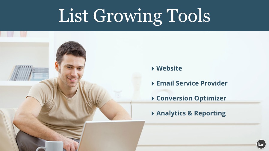
List Growing Tools
What do you need to start growing your list? Here are four critical tools:
- Website. Yes, you can grow your list offsite and even offline, but the bulk of your energy and focus should be on your site. Your website should be a lead machine, and the best way to generate leads is through an email signup.
- Email Service Provider. You'll need an ESP like Constant Contact, MailChimp, AWeber, or whichever reputable company you like.
- Conversion Optimizer. This is what I call products like LeadPages, which we use here at flyte. OptinMonster or Unbounce are other examples. I find ESPs are great for managing your lists and sending out emails, not as good at helping you optimize your conversion rate. I use LeadPages in conjunction with Constant Contact for better reporting and improved conversions.
- Analytics & Reporting. Google Analytics, your ESPs reports, and reports from your conversion optimizer will tell you how new subscribers found your site, exactly which opt-in form is effective (and which isn't), and which offer generates more subscribers, among other important pieces of data.
Website Tactics
As I sat down to create the presentation, I decided to use flyte's own email marketing campaigns for screen captures. This turned out to be an eye-opening experience!
We have been doing email marketing for so long, and run so many different campaigns, that trying to get data was a nightmare! Our email marketing garden had become overrun! I found so many inconsistencies that I spent two full days hacking away at the overgrowth so we could get back to proper marketing and measurement. Here were some of the problems and inconsistencies I found:
- Four separate landing pages after people subscribed. In other words, depending on how they subscribed, they could end up on four separate “thank you” pages. Each with its own messaging. One was actually a 404 error page! (Oh, the horror!) We were only measuring one of those landing pages, so our analytics wasn't giving us accurate data.
Now, there's nothing wrong with having different thank you pages, but only if that's part of your strategy! The problem is that unlike your home page, you don't see your email signup pages very often. Do yourself a favor: go try and subscribe to your email newsletter from multiple places on your website.
- Asking for different amounts of data. In some cases we asked for only an email address. In others, first name and email. In still others, first, last, and email. Again, there's nothing wrong with this if it's part of a marketing strategy…this was just the outcome of different people creating different forms. (I've since wrote up a document of how flyte will create new signups moving forward.)
- Frankenstein welcome messages. By this I mean that we had a clever welcome message after someone signs up that I wrote over 10 years ago. As time went on it got amended and updated, but when I looked at it today I realized it was woefully out of date in some places and completely contradictory in other places. I overhauled it.
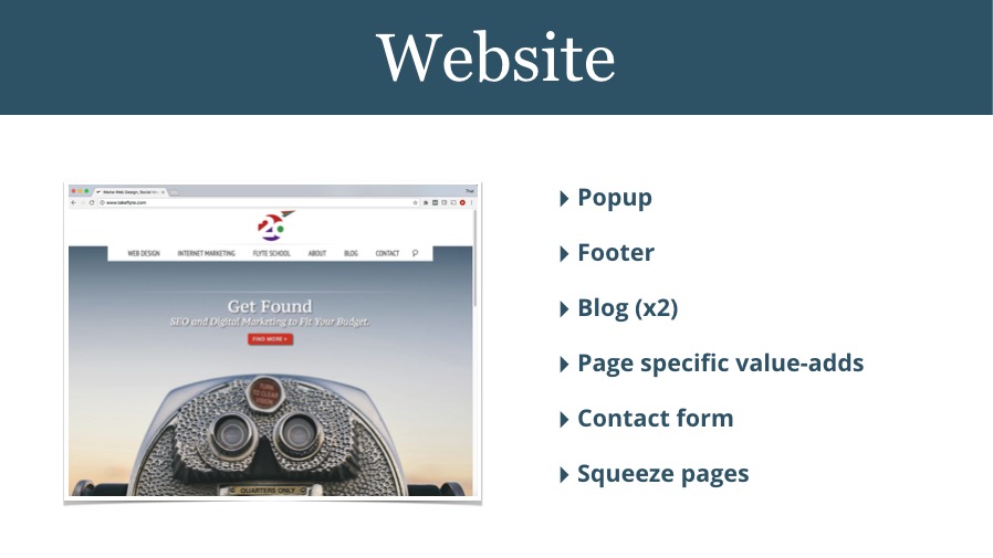
After spending time cleaning up the site, I ended up with six distinct ways people could subscribe:
- Popup window (don't groan)
- In the footer of every page
- In the blog (header and sidebar)
- Page-specific value-adds (more on that in a moment)
- Contact form
- Squeeze pages
Let's take a look at each one in more detail.
Popups for Email Signups
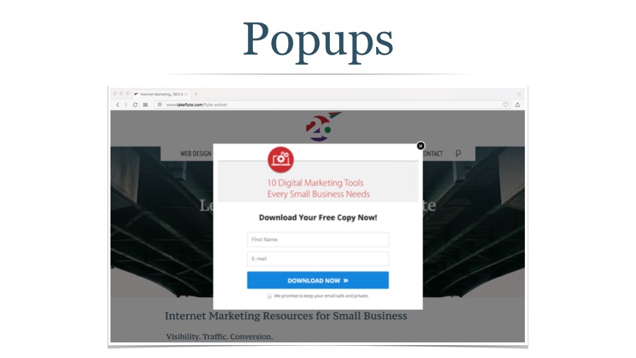
Marketers love them, website visitors hate them. That's the general consensus, right?
I know I was getting tired of them. When I'm on a site that throws up a popup (technically a “light box” or “modal window”) as soon as I land there I'm looking for the X to close it before the offer even appears. I assume everyone is like me. We've developed “popup blindness.”
It's like walking into a discount furniture chain and having four sales people grab a limb each and try pulling you to their section of the store: too much, too fast. Just let me browse.
So, a few months ago, with no data to back me up, I deleted the popup from the site. But, since I am now trying to measure everything I looked at the report in LeadPages. It showed me that even though I may find them annoying, 1,666 people signed up via the popup form while it was running and had a conversion rate of 1.41%.
I quietly turned it back on.
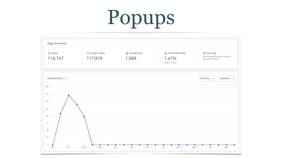
I did make one change, however: I delayed the popup until a person had visited two pages on the site, and then waited another 20 seconds after that. (This is something you can do with LeadPages.)
Next steps: Let the new popup run for a month and see if conversions and our conversion rate rises or drops. Based on that I'll tweak the form some more.
Email Signups in the Footer
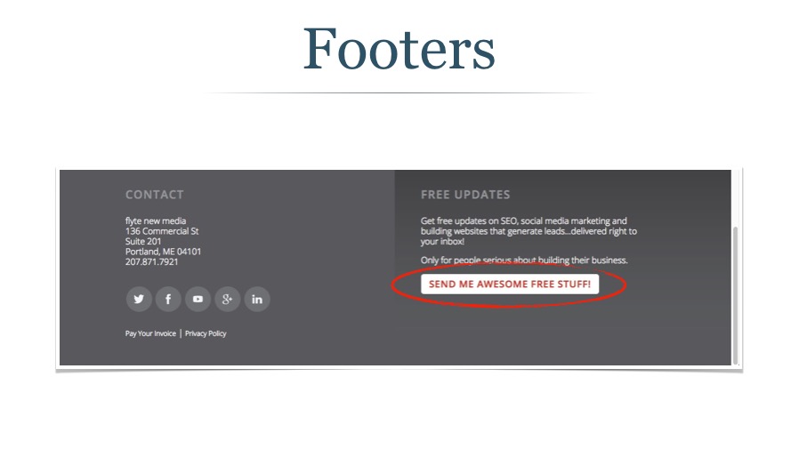
At the bottom of each page there's an email signup button with the call to action (CTA): SEND ME AWESOME FREE STUFF. If you click on it you are shown a signup form asking for first name and email.
Of the 80,359 people who clicked on the CTA, 1,324 signed up for a conversion rate of 1.65%.
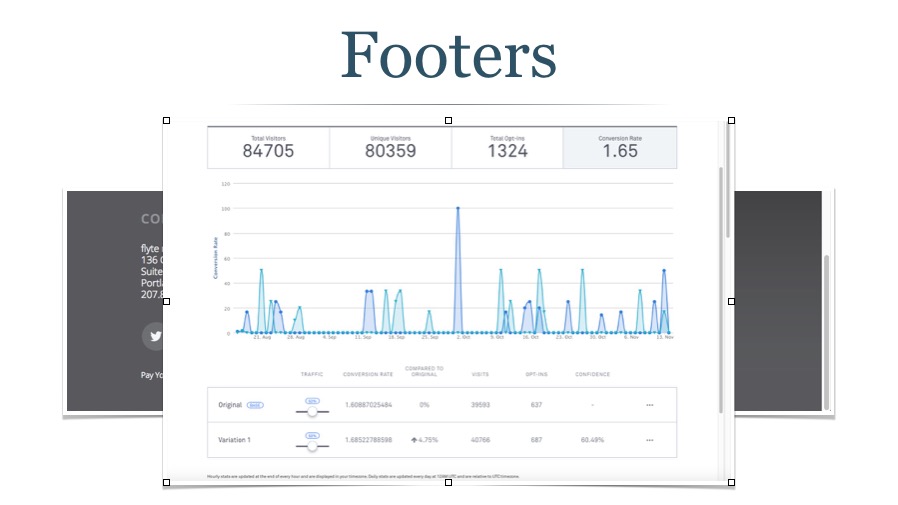 This seems low to me. Even though it's higher than the popup form, remember that this signup box is only shown if someone clicks on the button, which to me signifies intent.
We also were running an A/B split on this signup. That means we created two signup boxes, each with a different image, and randomly showed visitors one or the other. The variation had nearly a 5% better opt in rate.
Next steps: Try and figure out why our opt in is so low here. Shut off the underperforming box and A/B split test the winner. Experiment with a sticky footer instead of burying the signup at the bottom of each page.
Using the Blog to Get Email Signups
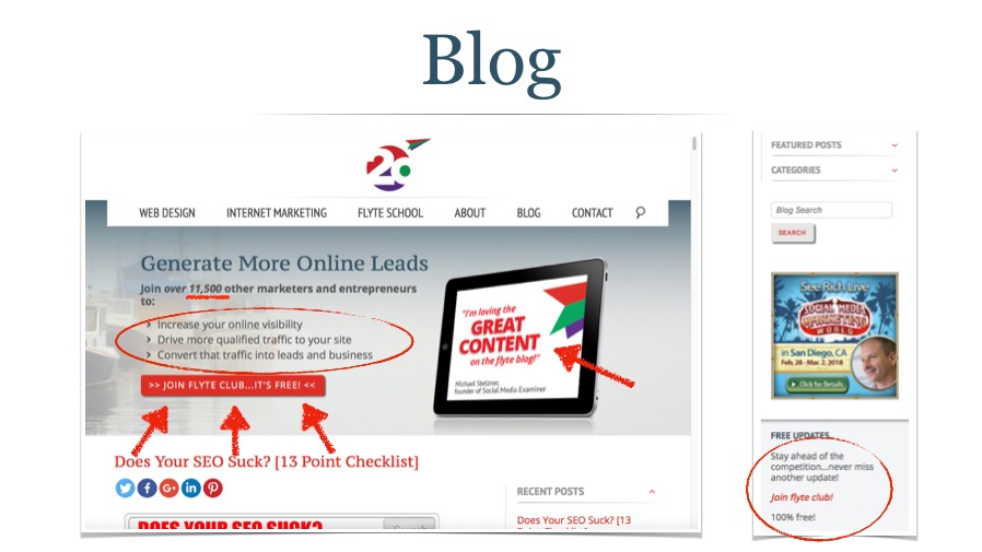
We have two places you can subscribe on our blog: one is the header, which only appears on the blog home page, and the other is the sidebar, which appears on every single blog post, as well as the blog home page, category pages, etc.
We're doing a few things in the header of note:
- Social Proof: we list the number of subscribers and give a hint of who they are. If 11,500 other marketers trust us with their email, why wouldn't you?
- Setting expectations: we tell people exactly the type of content they'll receive if they sign up.
- Influencer quote: we have a quote from an industry influencer.
- Obvious signup CTA: You can't miss the signup button which opens a box asking for name and email.
The sidebar, on the other hand, is awful. And I wrote it! The come on is weak, there's no real incentive, and the link is underwhelming.
When I looked at the stats I realized that the header and sidebar were both being counted, so I can't tell if one is doing a better job than the other.
The number of signups is low (202), but the conversion rate far exceeds any of our other signups at a healthy 9.32%.
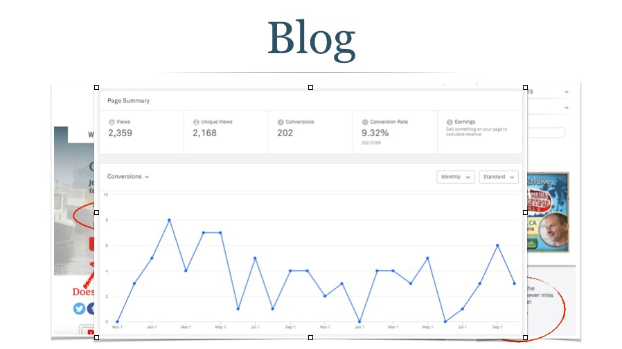
Next steps: Separate the sidebar and header to get better data. Let it run for another month and then experiment with A/B split testing and a stronger CTA in the side bar…but again, make that decision after I get more and better data.
Page Specific Value Adds
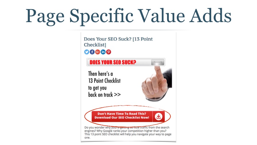
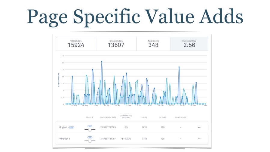
This is something you can easily do if you already have a blog. Find a heavily trafficked post (thank you, Google Analytics) and create a download that compliments that content.
In this image, you can see a blog post about 13 potential problems with your SEO. I turned it into an easy to digest checklist for people who didn't want to read the whole post or wanted to take the checklist “with them.” This is similar to the footer where when someone clicks on the button they see the signup form.
This is a fairly recent post, so the data isn't valuable yet. We have an insanely high conversion rate, but not many signups.
In another example, we had a highly ranked and trafficked page on Facebook Ad Manager, but it wasn't leading to any business. So we added a Facebook Ad Planner that we had already created for clients, and used that as our value-add. We actually had this popup trigger about halfway down the page, so we were only showing it to people who had shown some interest in the topic.
Using Your Contact Form as an Email Opt-in
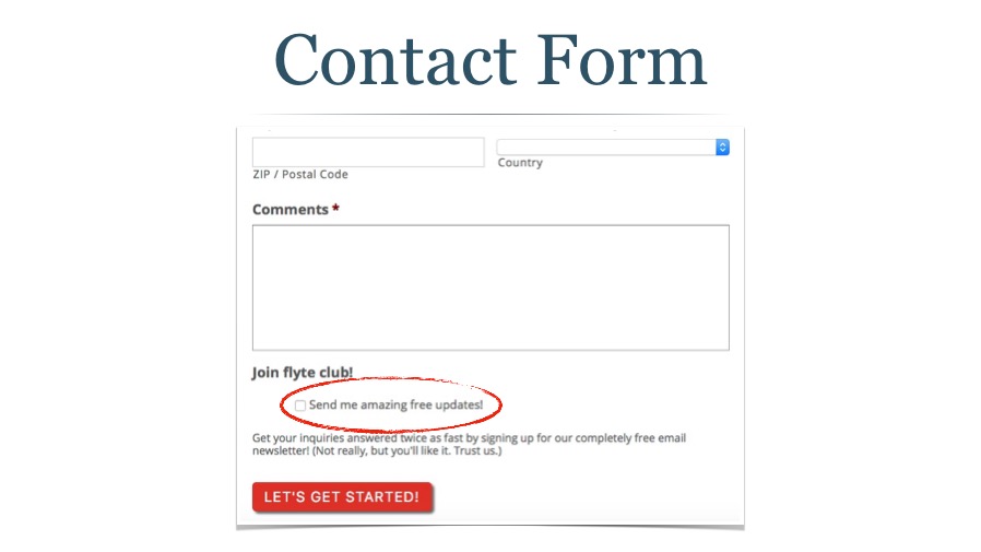
We also ask people if they want to join our email list as part of our contact form. We chose to go opt-in rather than pre-check the box and require people to opt-out.
I don't have metrics on this because we're not running it through LeadPages, but honestly I don't think it's all that important. If someone's filling out our contact form it's generally because they're interested in doing business with us. Getting them on our email list is gravy.
Next steps: None, except maybe I'll look into whether there's a simple way to measure our email opt-in conversion list and then experiment with a stronger CTA.
Landing Pages for Email Signups
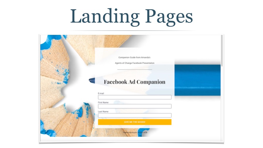
We've also got some pages on our site that you can't navigate to. They're mostly for paid search and social ad campaigns, or possibly directed from a speaking gig.
We've always set them up without any navigation…the idea being that we want to limit distractions to increase conversions.
Next steps: Question assumptions. A/B split all future landing pages where one version is without navigation while the other looks like a typical takeflyte.com page with navigation, side and footer bars, etc. See which one comes out on top.

How to Increase Conversions
We've spent a lot of time looking at different ways to get people to sign up for your email list…let's talk for a bit about how to improve the conversion rates at each of these doorways.
- Draw Attention. You can draw attention to your signup boxes with contrasting colors, size, movement, and imagery (arrows, fingers pointing, or even just a person looking at the opt-in.)
- Build Trust. As we discussed above, you can share the size of your list or get testimonials from subscribers, customers, or industry influencers.
- Establish expectations. Tell people how often you'll email them and what type of content they will receive. Is it discounts in the company store, or educational information that will improve their life, health, or relationships?
- Create an offer. This is paramount. Although you don't need an offer or giveaway with every signup box, you do need to create an irresistible offer that makes people think that they'd have to be a fool not to give you their email.
What Type of Offers Improve Conversion Rates?
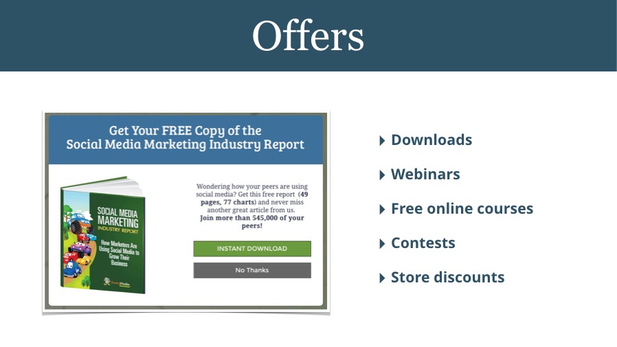
There are a lot of different types of offers. One thing to keep in mind is that people are less likely to sign up if there's a significant time investment on their part. A thirty minute consult with you may be incredibly valuable, but for someone who doesn't know or trust you yet, the time investment is on their end, not yours.
Here are some popular offers that can turn visitors into subscribers:
- Downloads. An ebook, white paper, or industry report works well. But you don't have to always create something new. You can bundle related blog posts into a PDF as a giveaway.
- Webinars. Yes, there's a time investment on the subscriber's end, but I've found this to be a powerful way to get new subscribers.
- Free online courses. I've known many a digital marketer who blew up their list by offering a simple free online course that then led people to buy a more in-depth, expensive course.
- Contests. Raffles or giveaways are great as well. If you have a big ticket item randomly choosing one subscriber a month for the product or a coupon good in the company store can work well.
- Store discounts. Everyone likes a deal.
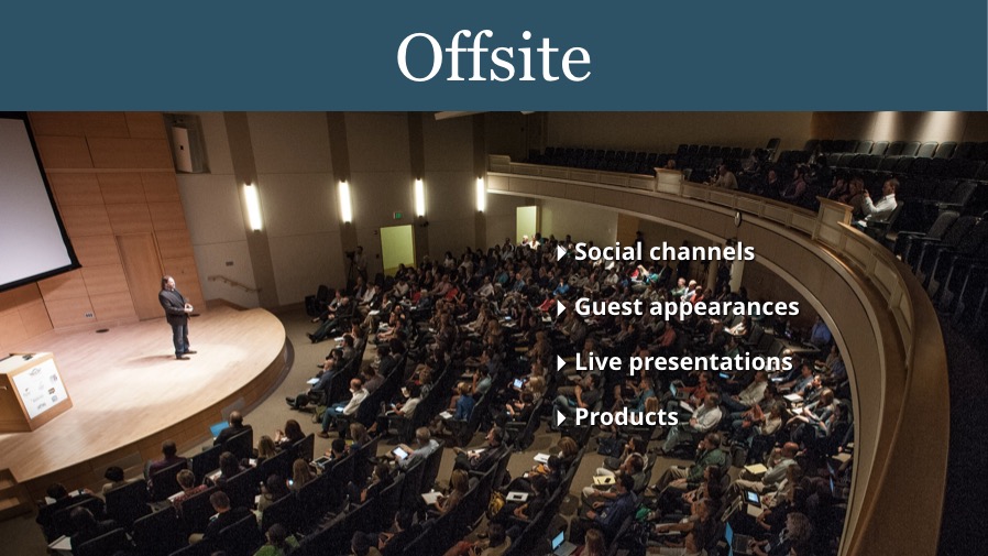
Offsite Methods for Growing Your Email List
There are many ways to grow your email list offline as well.
- Social channels. Sites like Facebook, Twitter, and Slideshare allow you to collect email addresses from people without even making them leave the site. (Alternatively, you can and should be using social media to drive people to an opt-in page on your own site.)
- Guest appearances. Are you ever a guest on someone else's blog, podcast, or radio show? Create a special URL to drive listeners or viewers to for a free gift behind an email signup.
- Live presentations. Create (or repurpose) a value-add and ask people to either give you a business card so you can send it to them (and be clear they're being added to your list) or create a simple opt-in form they can access on their smartphone.
- Products. Writing a book? Create a workbook readers can download from your site and put it behind an email registration. This can really be done with almost any product (crockpot includes link to recipe book) and is helpful when you're not the actual seller (Amazon, or really any retailer.)
Download the slides & notes now!
Wrapping Up
If you want more customers, more growth, more sales, more revenue, then you need to put more effort into your email list building activities.
- Create more opportunities for people to opt in at your website.
- Create irresistible offers that will overcome people's hesitancy to give you access to their inbox.
- Experiment and measure with A/B split testing.
- Work in some offsite channels as well.
There's a lot more to email marketing than list building, but hopefully this will get you started!
Any other ideas on opt-ins or ways to improve conversions that I didn't mention? Any list building tools, tips, or tactics I didn't cover? Let me know in the comment section below!
